
As UX Lead for this HHS Federal Health Program website, I directed a team of two designers while staying hands-on with user research, wireframing, and high-fidelity design in Figma. I collaborated closely with developers and content strategists to ensure seamless USWDS implementation and AAA WCAG accessibility compliance. Together, we delivered a federal website that meets rigorous standards while providing a clear, user-friendly experience for researchers, health professionals, and the public.
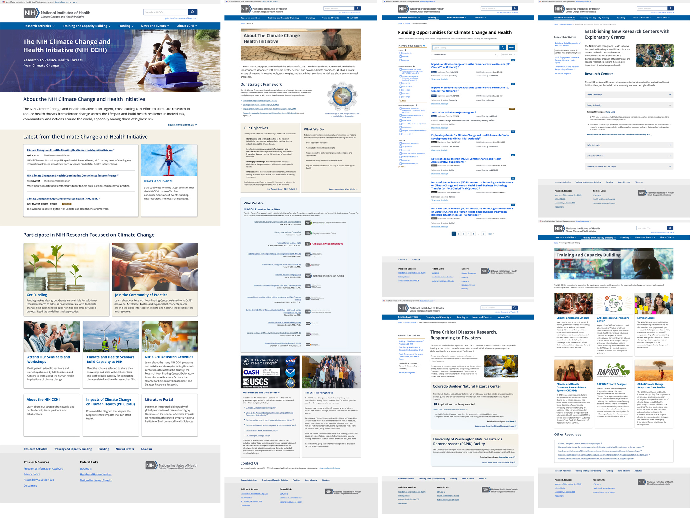
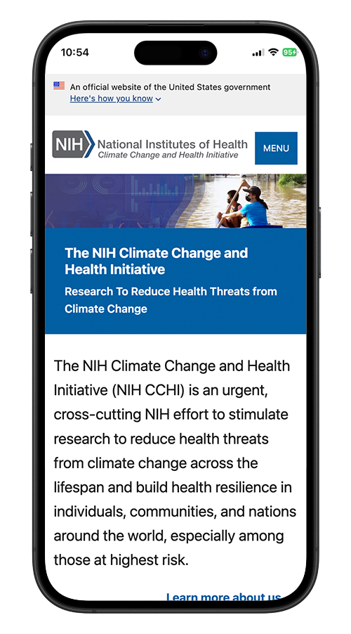
The goal of this project is to design and launch a fully accessible, USWDS-compliant federal website for the HHS Climate and Health Program from the ground up on a tight timeline. The site aims to meet AAA WCAG accessibility standards, provide a clear and intuitive experience for researchers, health professionals, and the public, and establish a scalable design system to support future updates.
The HHS Climate and Health Program provided a general style and feel to guide the website design and user experience, but it did not include detailed direction for accessibility or interaction patterns. Meeting AAA WCAG requirements introduced additional challenges, as these standards demanded careful planning and implementation without a defined project timeframe. Compounding the complexity, the website content was being developed in parallel, and there was no complete sitemap available at the outset, requiring the team to design and structure the site while content and navigation were still evolving.
To address these challenges, my team began by developing style tiles with the client to establish the overall design direction. We then created atomic design elements and adopted USWDS components, effectively building a design system with reusable “drop-in” elements before designing templates for individual webpages. A centralized Figma project library ensured consistency and enabled rapid updates across the site, making it easy to adapt the design as the structure and content evolved.
Style tiles were our first step in shaping the website’s personality and visual tone. They captured the mood through color, typography and imagery, giving the client an immediate sense of the experience we wanted to create. Rather than focusing on pages or components, these tiles communicated the feeling of the future site. As part of this phase, we also designed the program logo in alignment with the HHS style guide to ensure brand consistency within the broader federal ecosystem.
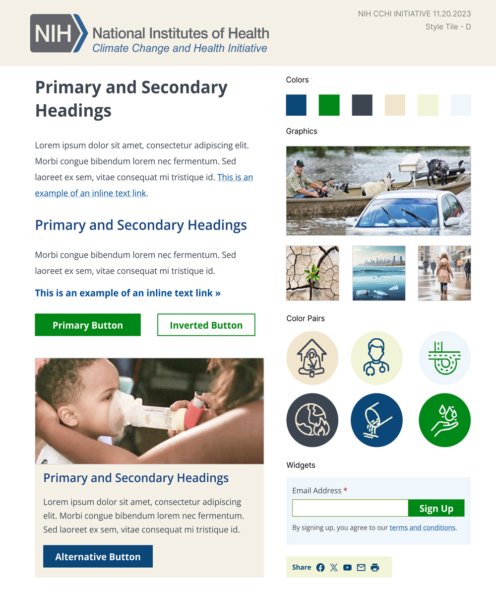
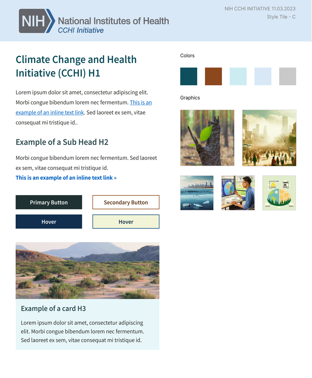
By exploring multiple visual directions, we quickly identified what resonated with stakeholders. These early explorations helped build consensus on the overall aesthetic while leaving room for flexibility as content and structure evolved. The selected style tiles then informed the atomic design elements, ensuring that every UI element and page template carried the intended tone consistently across the site.
We translated the approved style tiles into a structured set of USWDS tokens, defining fonts, colors, spacing, and other foundational design variables. These tokens allowed us to align the federal website with the client’s desired visual tone while ensuring strict adherence to accessibility standards. By establishing these tokens first, every subsequent component, layout, and interaction could draw from a consistent and scalable foundation.
Creating these tokens also made it easier to prototype and iterate quickly. As content and page structures evolved, the team could adjust a token in one place and see the change propagate across the design. This approach minimized inconsistencies, accelerated design decisions, and laid a clear groundwork for adopting USWDS components.
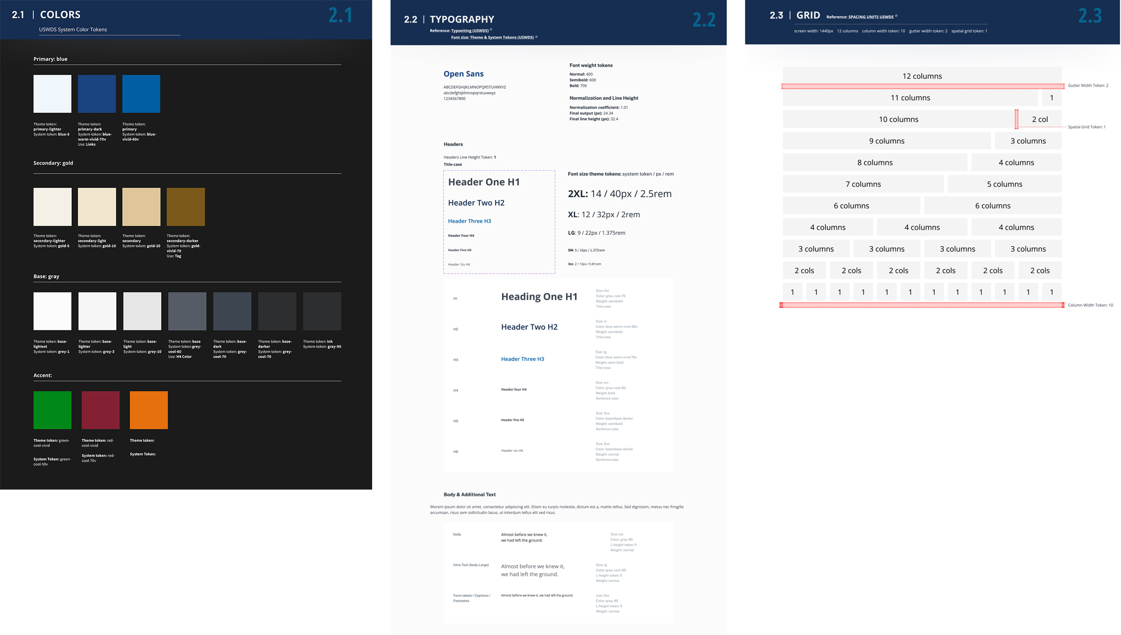
Once the foundational USWDS tokens were established, we began systematically adopting components, starting with the simplest elements and progressing toward more complex interface patterns. Each component was configured using the defined tokens and expanded into meaningful variants to support different content needs and interaction states. Responsiveness and accessibility were validated throughout, ensuring every element functioned consistently across screen sizes and met federal standards from the outset.
As the component set matured, we consolidated everything into a structured Figma library. This enabled rapid page assembly, reduced redundant design effort, and ensured consistency across the evolving site. The upfront investment in systematizing components allowed the team to move quickly in later phases, transforming page design from manual layout work into efficient composition using prebuilt, standards compliant elements.
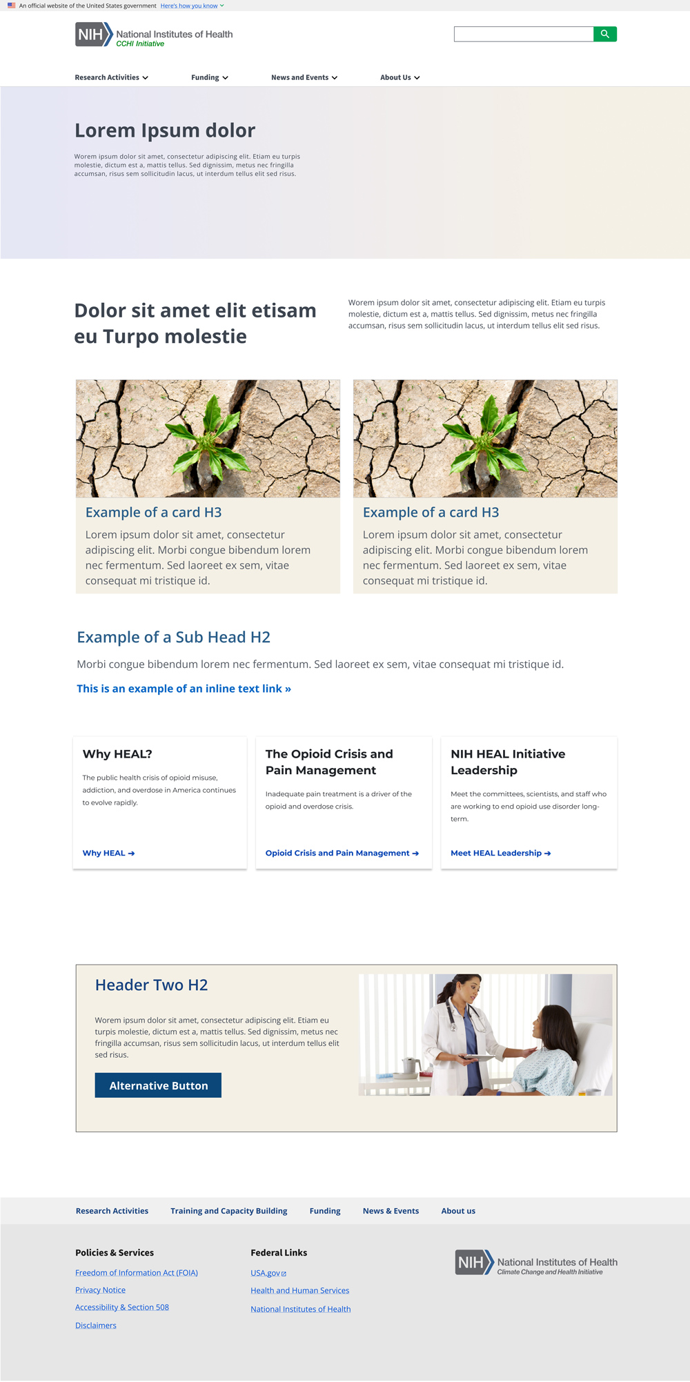
With the component library in place, we began designing page templates and assembling full page prototypes. Layouts were constructed using predefined tokens and USWDS components, allowing us to focus on hierarchy, clarity, and content flow rather than rebuilding interface elements.
As content began arriving, we transitioned from placeholder text to near real content across most prototypes. This significantly improved design accuracy and revealed refinements in spacing, hierarchy, and accessibility that only emerge with authentic material. Regular review cycles with stakeholders, content strategists, and developers ensured alignment throughout the process. When client feedback required a fundamental change, updates could be implemented at the token or component level and automatically applied across all prototypes through the centralized library. This system based approach allowed us to iterate quickly while maintaining consistency and federal compliance.
Once prototypes were approved, we prepared them for staging using Figma Dev Mode to ensure precise developer handoff. Specifications, tokens, spacing, and component behaviors were clearly documented, enabling the development team to implement designs accurately and efficiently. The centralized system minimized discrepancies between design and code.
After deployment to staging, we conducted structured review sessions with the development team to evaluate full pages and individual components against the approved prototypes. These collaborative reviews allowed us to identify inconsistencies early and align quickly on refinements.
Accessibility validation included both automated and manual testing across desktop and mobile devices. We ran automated scans using Wave to identify contrast issues, missing form labels, ARIA errors, and structural violations.
We manually tested keyboard navigation, focus management, screen reader behavior using VoiceOver, responsive layouts, and touch target sizing.
SEO best practices, including heading hierarchy, meta descriptions, and semantic HTML, were also incorporated to optimize discoverability.
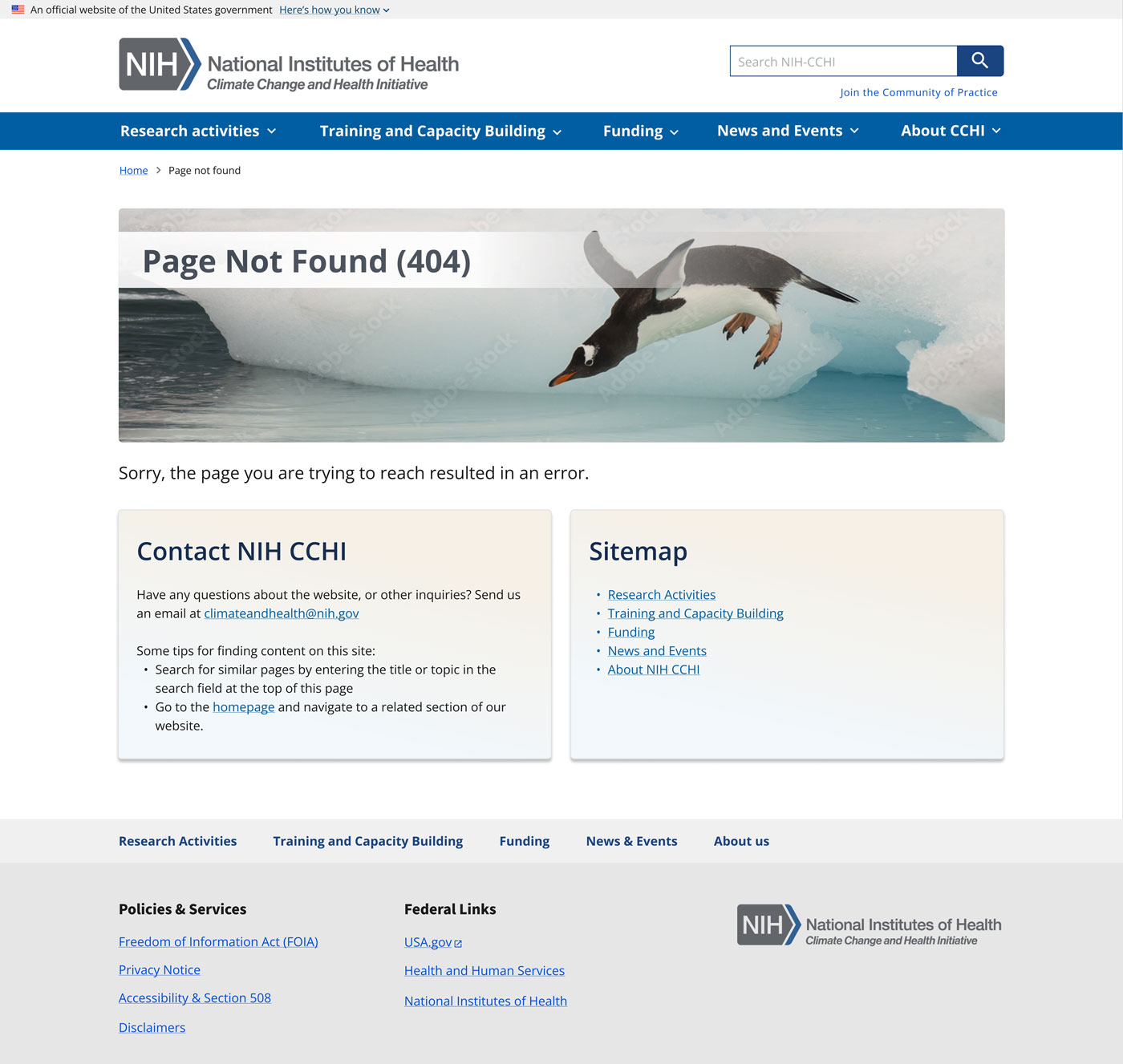
From the outset, we built full pages with real content, ensuring the site was functional and meaningful at every stage. During prototyping, we defined core page types while remaining flexible to add new ones as additional content emerged, reflecting evolving user and program needs. Most pages were built directly on staging, often using quick Figma mockups or even skipping traditional wireframes, leveraging the established design system to maintain consistency and speed.
Working closely with content strategists, we introduced new USWDS components as needed and applied established design tokens across all layouts. This ensured typography, spacing, and interactive elements aligned seamlessly with authentic content. By combining content integration, component adoption, and accessibility considerations, the team delivered a fully functional, visually cohesive website that complied with AAA WCAG standards and was ready for federal launch.The website launched on schedule, fully functional, accessible, and visually cohesive. Immediately afterward, we began preparing for post-launch usability testing, creating test cases by analyzing user behavior, collecting direct feedback, and reflecting on internal lessons learned to identify opportunities for improvement. This continuous evaluation informs iterative refinements, ensuring that the HHS Climate and Health Program website remains user-centered, responsive to real needs, and fully compliant with federal accessibility standards.
© 2026 misunin.com

|

|

|

|

|

|

|

|