I led a UX team in the continuous improvement of HRSA’s design system, which serves as the foundation for multiple websites and subdomains across the agency. The project focused on creating a consistent, accessible, and scalable framework that could meet federal standards while supporting the diverse needs of users, content creators, developers, and subcontractors. By unifying design patterns and components, the system helps streamline workflows, reduce duplication, and maintain a cohesive user experience across HRSA’s complex digital ecosystem.
Create a fully USWDS-compliant design system that serves all HRSA web needs, continuously evolving and improving across live websites to ensure consistency, accessibility, and efficiency for all users and teams.
HRSA’s web presence was complex and fragmented, spanning multiple live websites and subdomains with difficult information architecture, inconsistent design patterns, components, and interactions. Users often struggled to find information and reported confusion and frustration when navigating the sites. Content creators faced challenges managing pages, and developers had difficulty maintaining code. Without a unified design system, teams were unable to deliver a consistent, accessible, and user-friendly experience across HRSA’s digital properties.
My team and I developed a USWDS-compliant design system capable of scaling across HRSA’s live websites and subdomains. Our approach followed a clear roadmap centered on four key artifacts, each serving a specific purpose in creating a consistent, accessible, and maintainable system. Together, these artifacts formed a robust, modular design system that enabled continuous improvement, streamlined collaboration across teams, and delivered a consistent, user-friendly experience across HRSA’s complex digital ecosystem.
To create a solid foundation for HRSA’s design system, I translated the existing style guide into web-ready design tokens. The original guide was built for print and marketing materials and wasn’t suited for digital interfaces. By aligning HRSA’s colors, typography, and spacing with USWDS tokens, I established the atomic elements that would serve as the baseline for all design system components.
The USWDS 12-column grid provided the structural foundation for organizing content, balancing flexibility for diverse site needs with the consistency required by federal standards. By introducing repeatable templates and modular grid combinations, I created a framework that streamlines design and development while ensuring accessible, user-friendly experiences across HRSA’s digital ecosystem.
The system is designed to:
A critical part of the design system was creating clear standards for how images should be used across HRSA’s websites. Inconsistent image quality, sizing, and accessibility practices often weakened the user experience and made content harder to manage.
To solve this, I established image guidelines that:
By codifying these rules, the design system ensured that imagery was not only visually consistent but also legally compliant, accessible, and easy for teams to implement. The result was a more polished and unified digital presence across HRSA’s many websites.
HRSA’s digital ecosystem includes a wide range of logos for its bureaus, offices, and programs. Historically, teams often recreated or modified these assets on their own, leading to inconsistencies in quality, format, and brand alignment.
I created a centralized repository that houses every HRSA logo in both vector and image formats. This resource ensures teams can easily access the correct, high-quality version of each logo without duplicating work. By standardizing logo usage and providing scalable formats, the repository supports brand consistency across HRSA’s websites and digital products while streamlining design and development workflows.
With the foundations in place, I turned to designing the components that shape HRSA’s digital experiences. These elements translate the principles of typography, grid, and brand consistency into practical, reusable patterns.
I conducted a comprehensive audit of existing components for USWDS compatibility, ensuring alignment with design tokens, verifying accessibility, and capturing every variation in detail. I also established clear guidance for component structure, atomic elements, and usage scenarios. To strengthen the system further, I identified and recommended new components to meet emerging needs and support the continued growth of HRSA’s digital ecosystem.
I developed a component roadmap to strengthen HRSA’s design system, auditing 25 existing components and defining 10 new ones. The roadmap set a clear timeline for evaluation, updates, and deployment in batches, allowing for steady rollout without disrupting ongoing work. This structured approach ensured immediate improvements while building long-term scalability, creating a balanced path for refining existing patterns and expanding the system with new, high-value components.
Each component was reviewed for alignment with the U.S. Web Design System, including use of design tokens, accessibility compliance, and structural flexibility. Input from usability testing, site analytics, and industry best practices informed the evaluation, ensuring that the audit was grounded in both evidence and standards.
Every component was tested for accessibility, with specific attention to keyboard navigation and screen reader compatibility. I documented all variations, from atomic elements to complex patterns, and identified areas where updates or standardization were needed. This process not only ensured that components met federal requirements but also created a unified reference for designers and developers, reducing ambiguity and supporting faster implementation.
Based on gaps in the system and evolving user and business needs, I proposed the gradual addition of 10 new components to HRSA’s design system. Each component was designed to integrate seamlessly with the existing framework, supported by clear guidance on structure, variations, and use cases. All components were verified for accessibility and ensured full compatibility with USWDS standards.
This strategic expansion strengthened the system’s scalability, enabling HRSA teams to deliver consistent, accessible, and user-friendly experiences across current and future websites.
While USWDS provides a robust framework, it does not cover every component needed to meet HRSA’s unique requirements. In cases where a component was not available in the USWDS library, I designed custom components guided by WCAG accessibility standards, best practices, and principles aligned with USWDS. Each component was built to maintain visual and functional consistency with the existing system, ensuring accessibility, usability, and a seamless experience across HRSA’s websites.
With a library of tokens and components in place, I developed a set of templates to streamline page creation and ensure consistency across HRSA’s websites. Templates served as blueprints for common page types, combining grids, components, and content structures into reusable patterns.
This approach reduced design and development effort, supported compliance with federal accessibility standards, and enabled teams to deliver content more efficiently while maintaining a cohesive user experience.
Templates define complete pages or sections built from repeatable, user-validated patterns. By codifying these into reusable templates, I provided teams with scalable structures that speed delivery, minimize inconsistency, and ensure cohesion across HRSA’s sites and subdomains. For users, these templates establish familiarity and predictability, building confidence through consistent experiences that align with their expectations.
Library template designed to organize large collections of pages, documents, or resources with keyword search, taxonomy filters, pagination, and ordering options. Available in multiple variations, this template became a foundational pattern, reused across all HRSA websites to support efficient content discovery and consistency.
A central HRSA calendar designed to display upcoming and past events in an intuitive format. It integrates filters, categories, and detail pages, making it easy for users to find opportunities and deadlines. The template syncs with the central calendar while showing only events relevant to each subdomain, avoiding duplication.
An editorial style guide developed with HRSA’s Office of Communications to ensure clarity, consistency, and accessibility across content. It defines standards for voice, tone, grammar, and plain language while aligning with federal writing requirements.
The guide helps content creators maintain a unified style across HRSA websites and subdomains, supporting a predictable and user-friendly experience.
The editorial style guide sets clear rules for acronyms, numbers, titles, lists, file names, and links to keep HRSA content consistent and predictable. It also governs meta descriptions, contact details, and directional language, strengthening accessibility and search. Aligned with the design system, these standards ensure content and components work together for a seamless user experience across all HRSA sites.
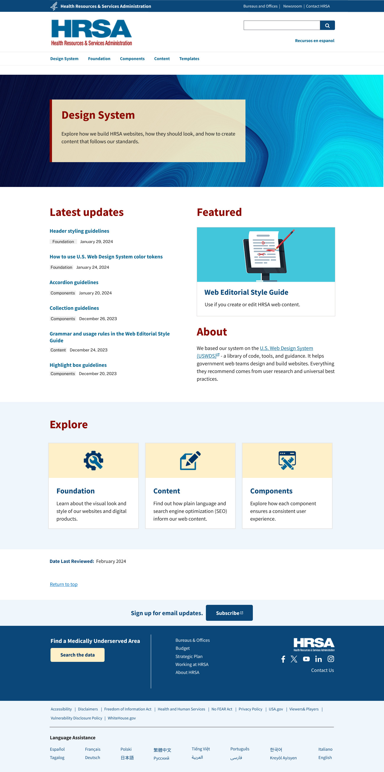
The new design system website serves as both a guide and a model.
Every element, from typography to navigation, reflects the standards it sets, showing teams what compliance and usability look like in practice. By following all guidelines to the letter, the site not only delivers clarity and accessibility but also builds confidence in applying the system consistently. The new design brings these principles to life, providing a trusted, living example of HRSA’s design language in action.
© 2026 misunin.com

|

|

|

|

|

|

|

|